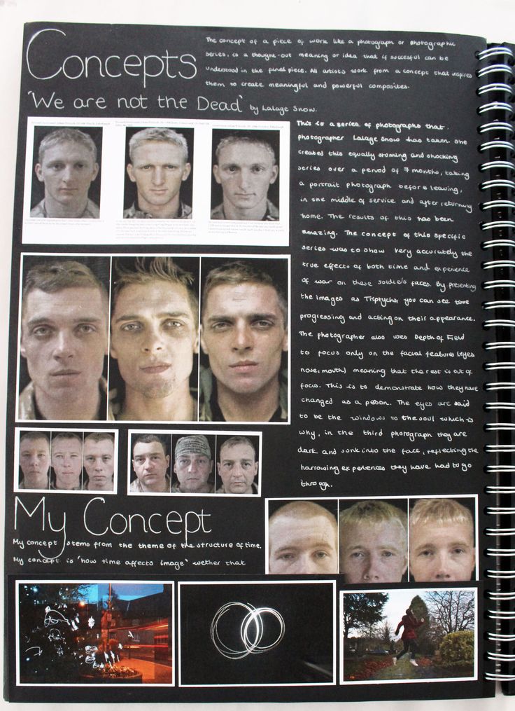
what is abstraction?
abstract/abstraction is a type of photography in which the photographs are unusual they are not basic and can make you explore new techniques in photography. Abstraction Can not always be identified as a landscape photo or a person as it is created and formed bya mixture of shapes and colours which can be considered strange. Or a person will be disfigured usually things will be in the incorrect place and moved somewhere else. Abstraction is a theme where a normal maybe dull and boring image can be made exciting or mysterious, it can also leave you wondering and questioning

My homework
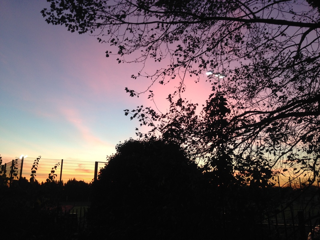
I like the photograph because of how the colours have been muted but are clear what they are. This photograph is abstract because of the bright colours being out of focused almost creates a completely new world.
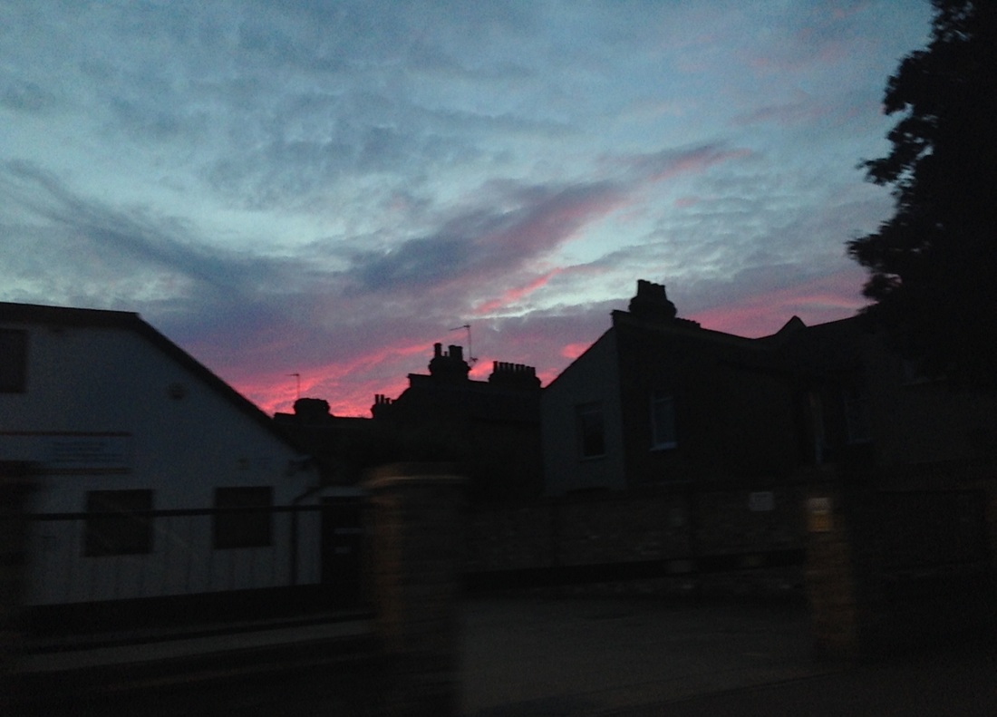
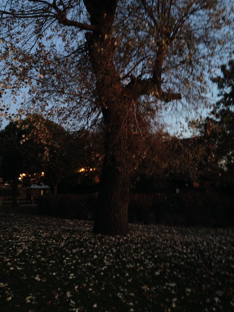
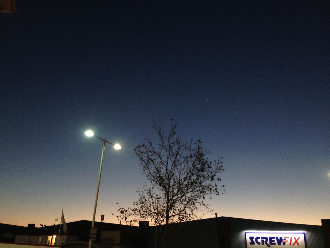
This photo was taken involved the evening on my phone as the sun was setting, this photo is also abstract because there is an odd light reflecting in the centre of the photograph.

The Process
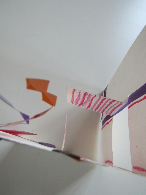
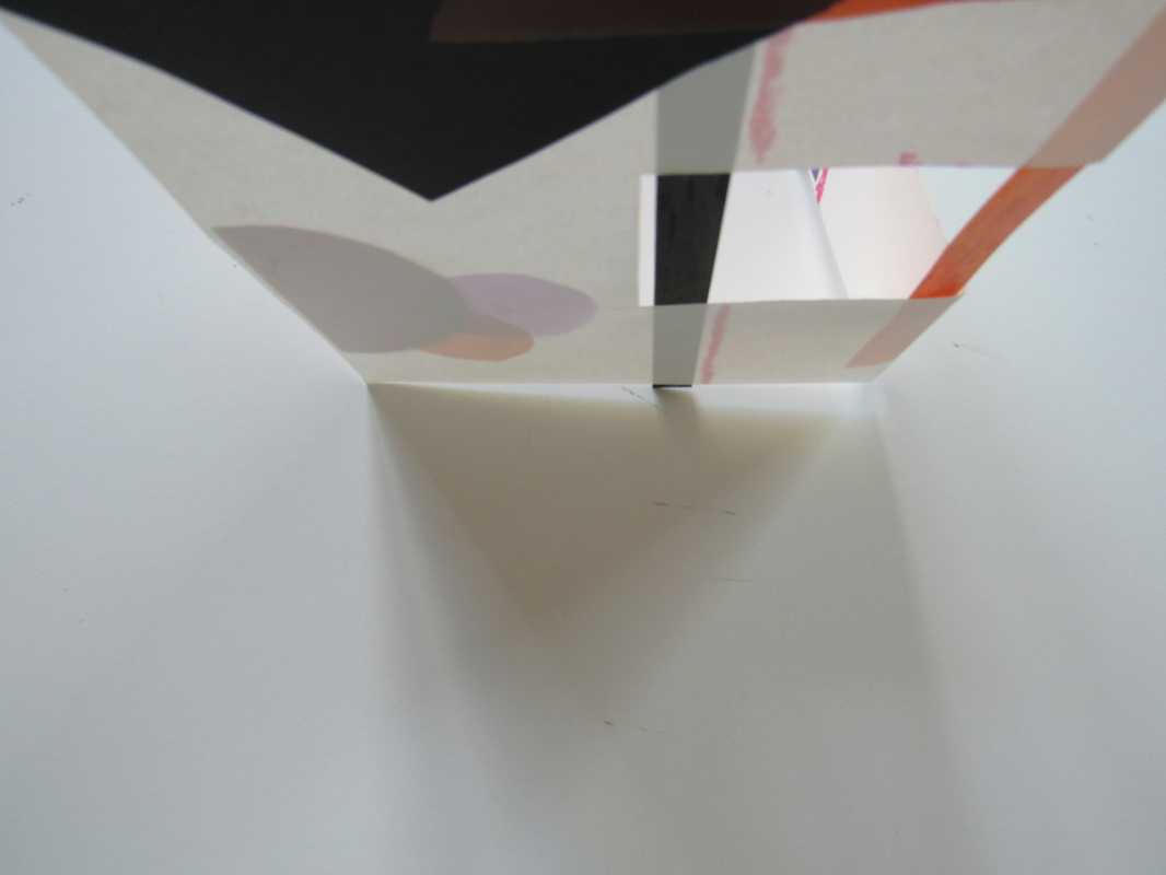
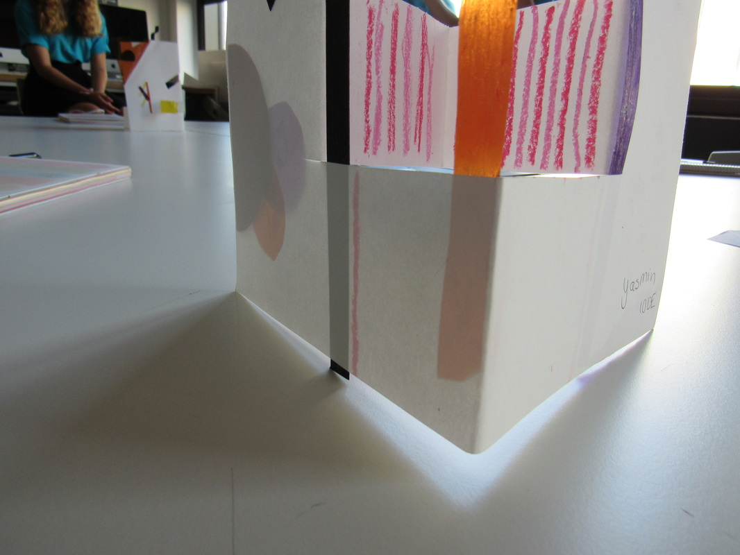
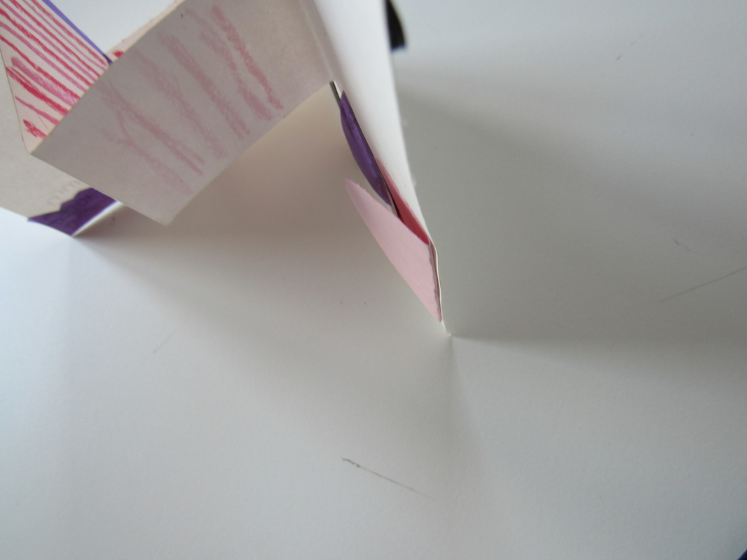
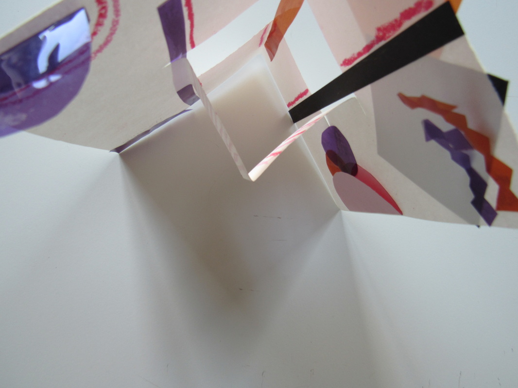
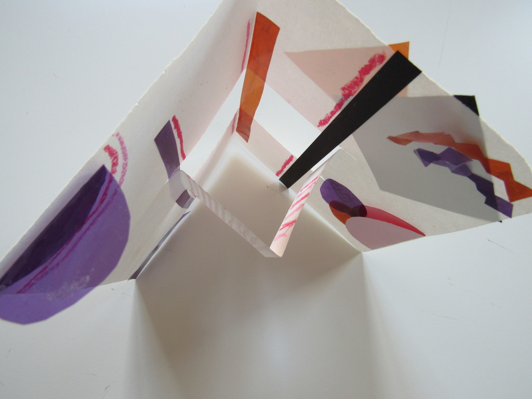
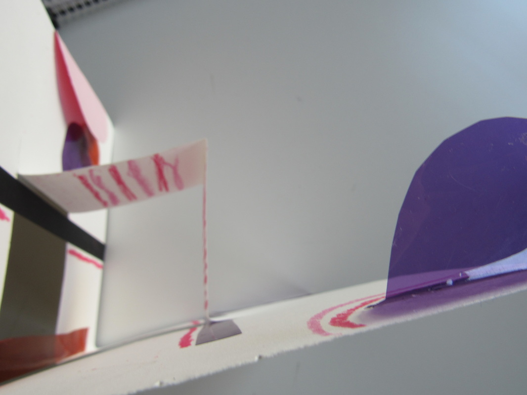
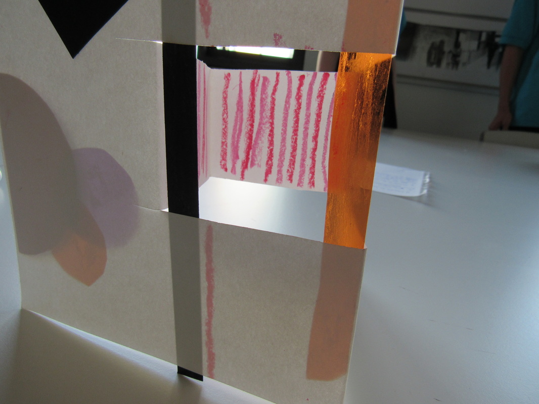
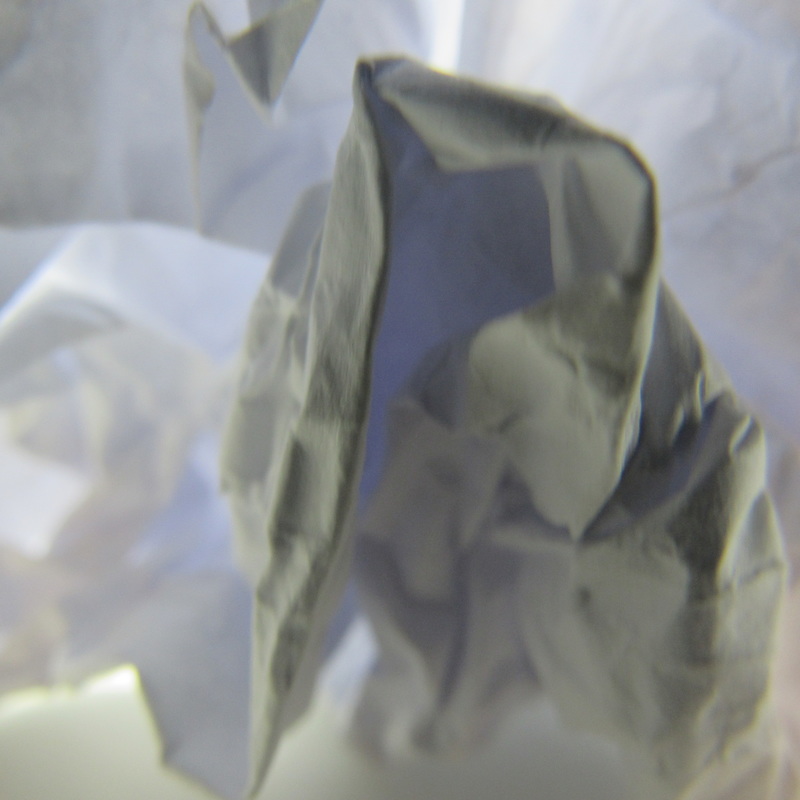
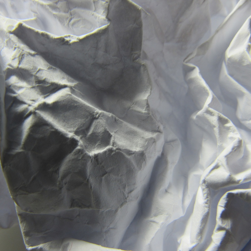
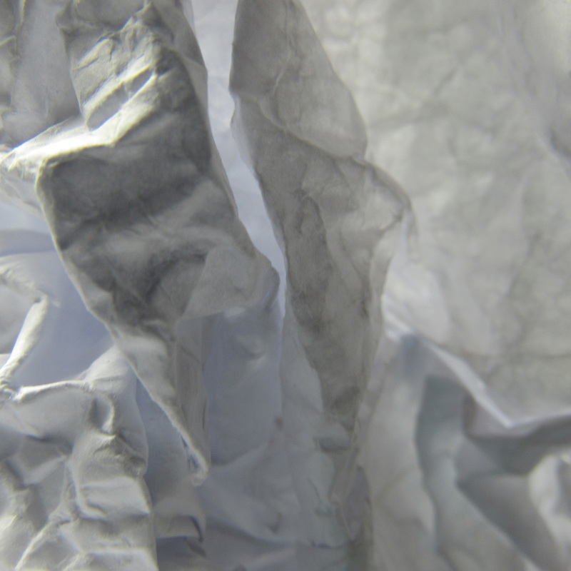
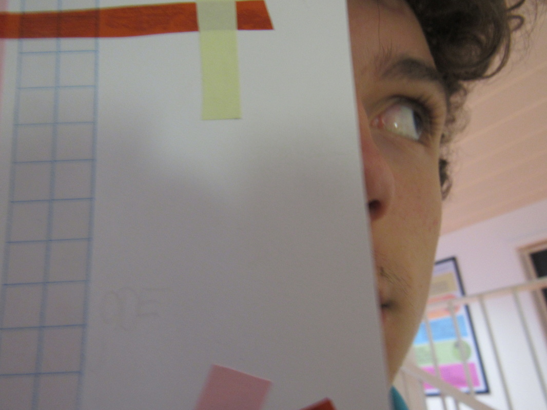
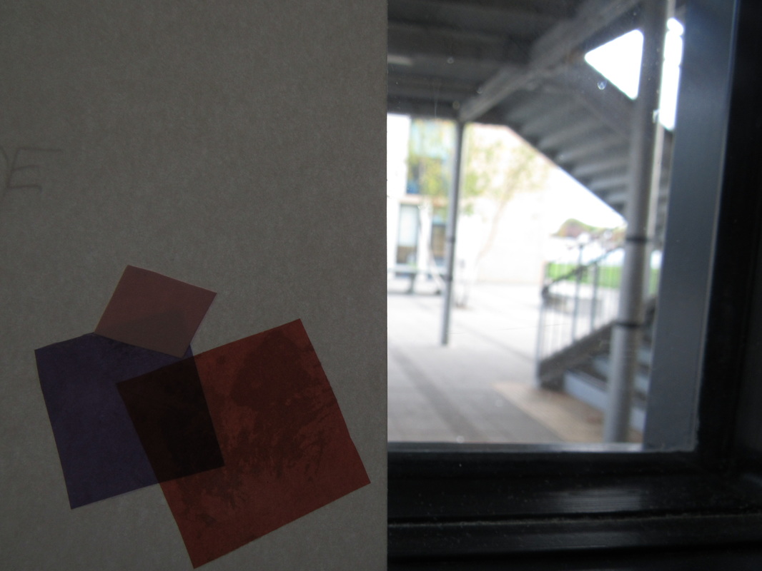
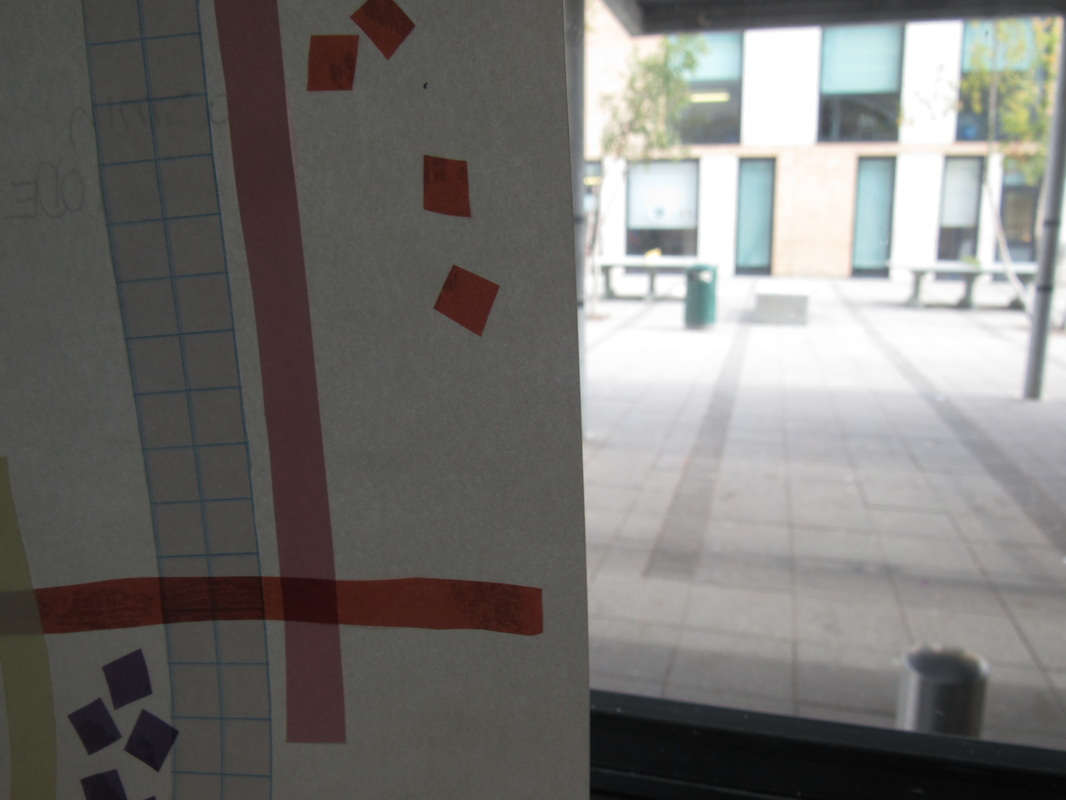
First we started of by creating an abstract sculpture by folding card and developing it with shapes and colours. However we attempted to create shapes that stick out which in the natural light would cause dark tones and shadows. The task was to take 12 pictures of our sculptures in the light with nothing else in the photo but the table, shadow and sculpture. We moved around with the camera looking at different angles this way we can get the different forms of shadows created whilst also showing the abstract sculpture. The shapes are formed with many different lines and take up most space in the background.
|
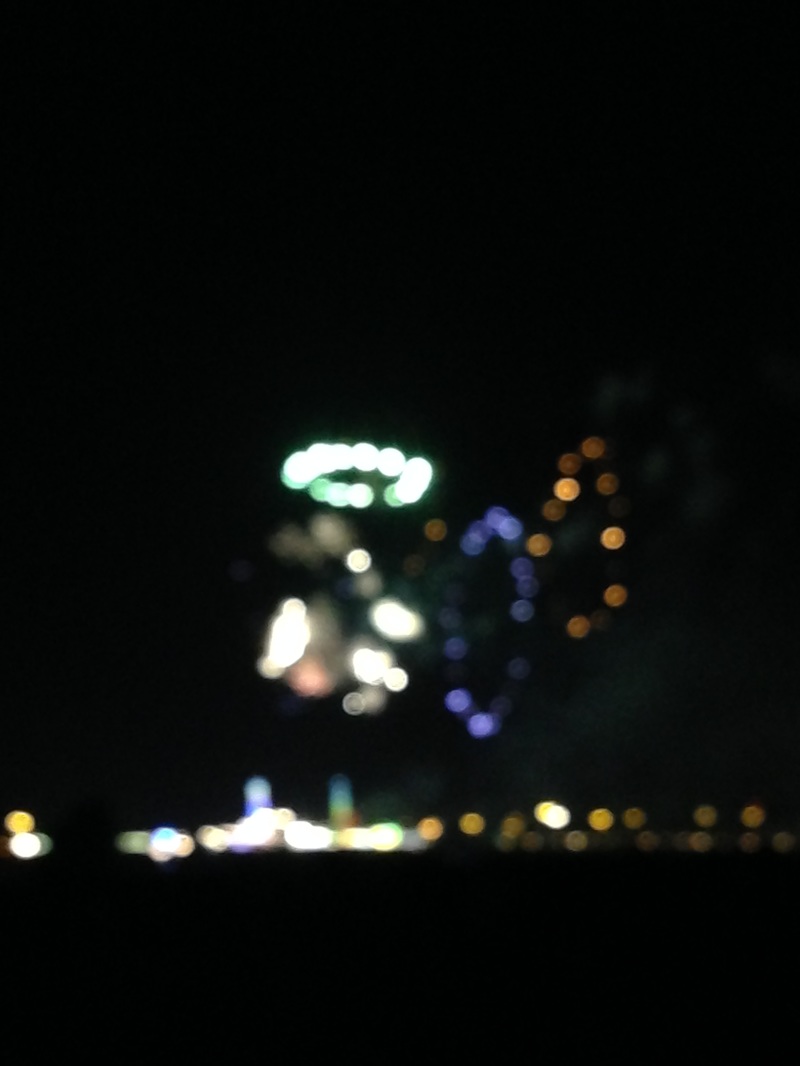
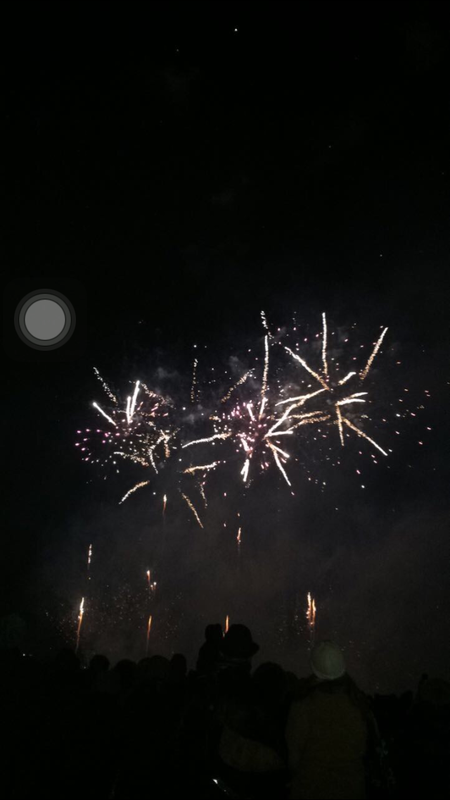
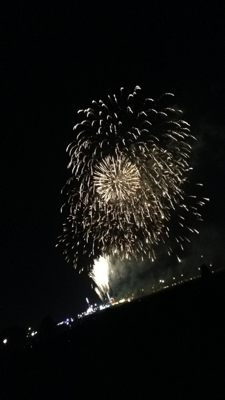
These are 16 abstract photographs we had to take for homework, i mainly focused on the idea of out of focus and bright colours. They are mainly all photos taken in the evening and as there was no strong lighting the photo would often turn out of focus. my favourite image is of the fireworks they are out of focus and there is also shapes that are formed such as circles and ovals and squares. But i also really like the colours that are from the sun setting. The colours are a main part of which makes this abstract. The images have not got a lot of abstract qualitys however they are classed as abstract as they are out of focus and include many colours and depth. These were taking on different days so that the photos did not all look the same. So there is photographs in the dark and day times so natural lighting and non natural lighting.
|
|


Evaluation
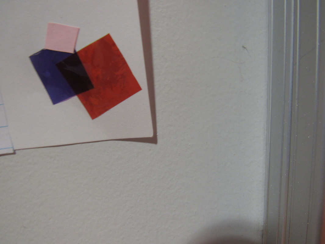
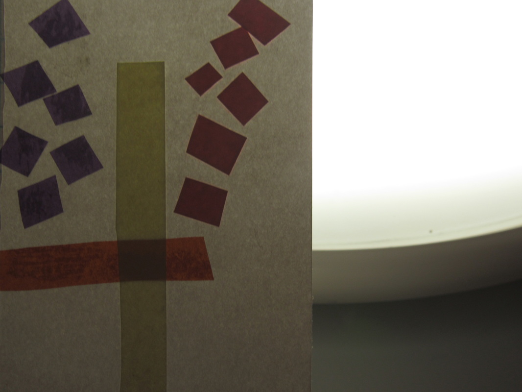
I found this task easy and somewhat difficult to get a good photo when you had different rules to apply, having to make sure no one was in the shot only the table & sculpture. Then moving it around in front of the light we looked at the shadows, most pictures were taken from a high angle. The sculptures look good because of how the shapes stick out and the bright colours come out well in the light. However the sculptures looked good, not many shadows were created out of my sculpture therefore was not that successful but when shadows were created they looked really good. The shadows were formed as squares and triangles as the sculptures had the same shapes. The colours, pink and purples worked really well together, however you also get a bit of orange shining through. We watched video for inspiration and to help us understand what it takes to take a good abstract photo.
https://uk.pinterest.com/yasminbarrett28/
|
|
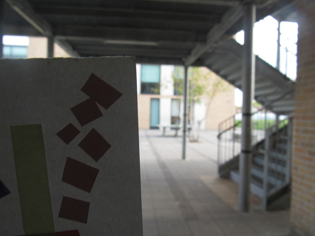
These are my abstract photographs, I found this task difficult because it was hard to use the scukpture in a photograph in an abstract sense. I believed that the orange and purple film looked effective because it went really bright when it got hit by the sunlight. it was more interesting to focus the background on a person and a building as my abstract card was not giving good shadows of walls and floors.
|
Abstract evaluation
|
|
|
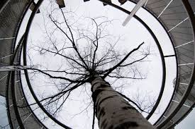
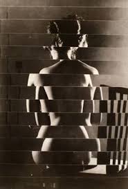
This is one of my favourite abstract photographs as it is very effective, it uses a lot of the elements for example. Light, the lighting is effective because it is a mixture of darks and lights. Angles the photo was taken at a low angle which created an almost creepy effect. Also there are also a load of curvy lines where there is a staircase.
|
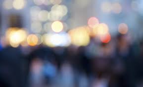
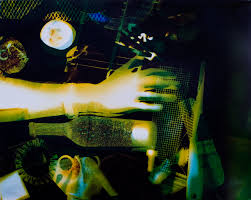
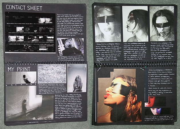
I chose this photo because I like how it is out of focus and how the colours are coming through. However you know that this is a street with car lights and lamp posts shinning through an out of focus lens. The brightest part of the photo is the centre where all the lights are shinning in the middle.
|
|
John Batho photography uses all formal elements, he uses unusual framing choices, and has a variety of different style pictures ranging from out of focus to in focus. from different angles to unusual people or objects. He also creates images of disrupted figures of men, women and kids standing/posing but is out of focus and painted black. John uses bright colours in dark areas which stand out. He uses curvy and straight lines and also has a mixture of dark and bright colourful photos. John Batho was born in 1939, normandy in France. He is the father of Delphine Batho she is socialist party politician.
|
|
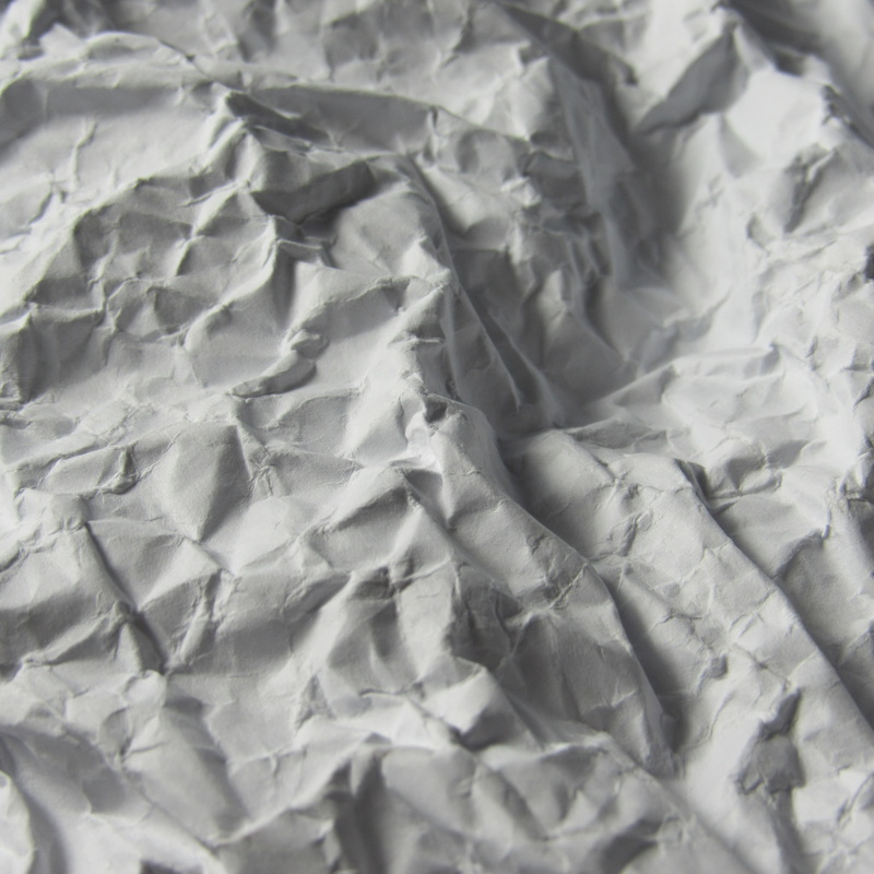
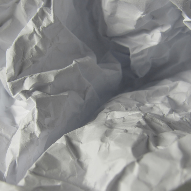
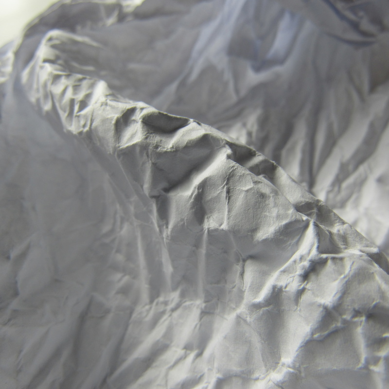
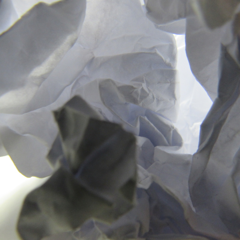
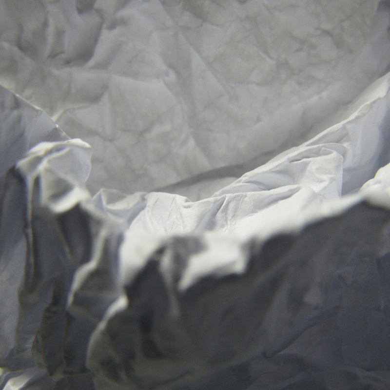
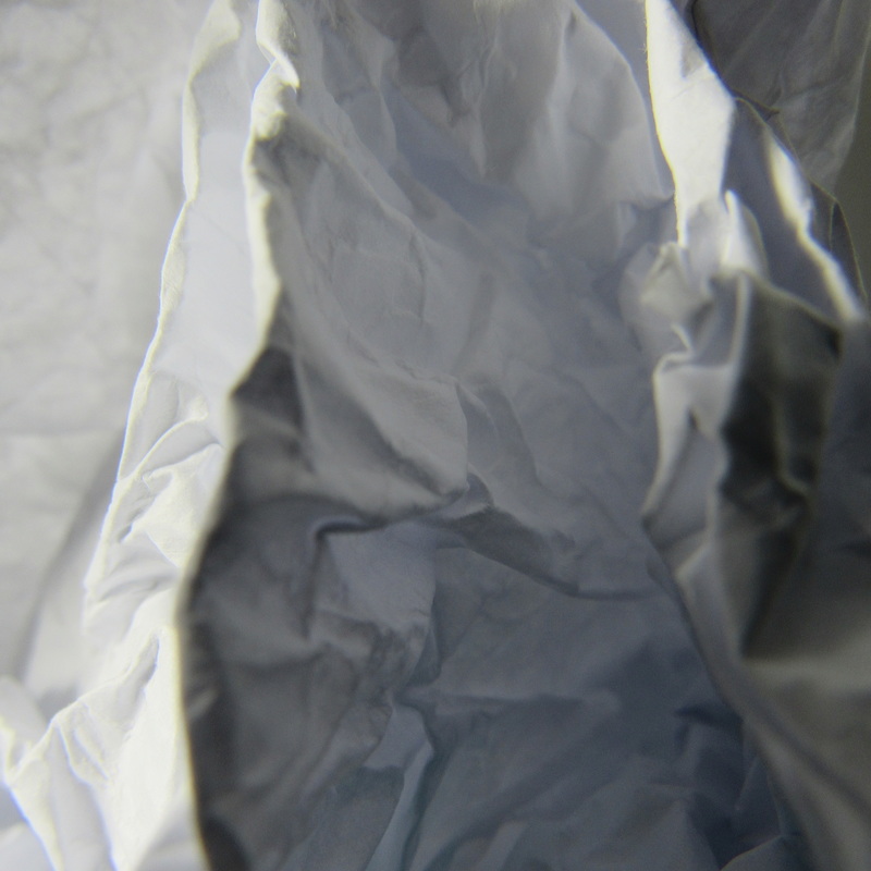
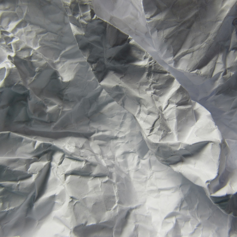
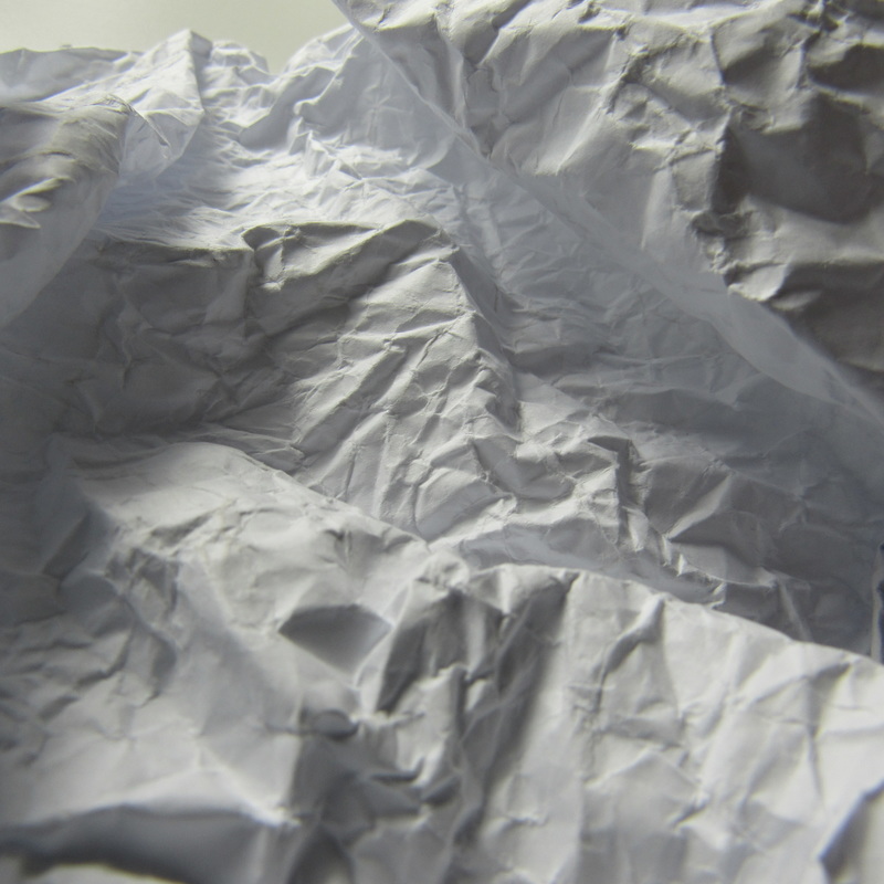
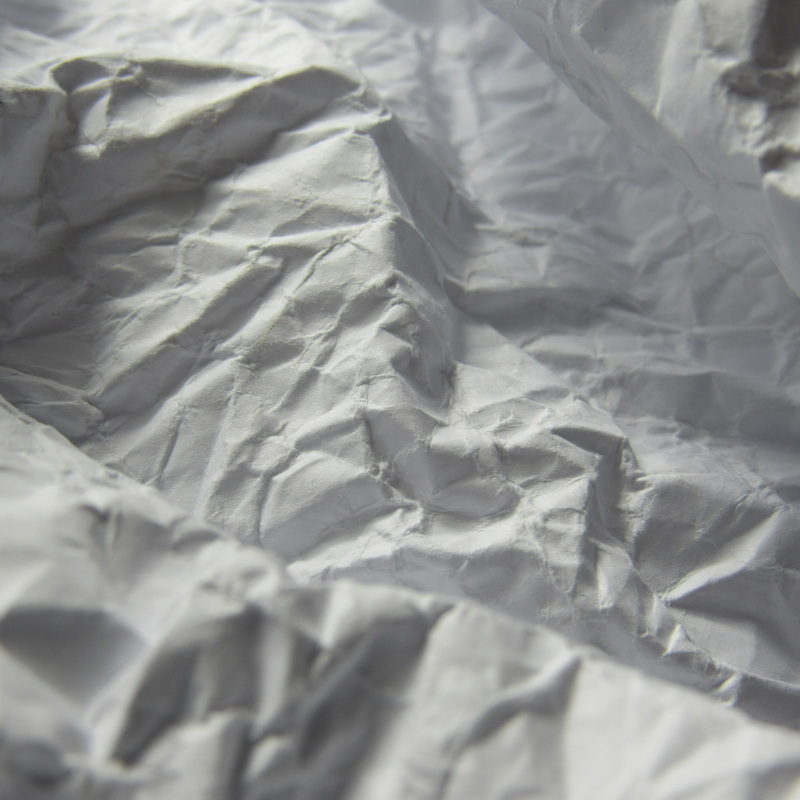
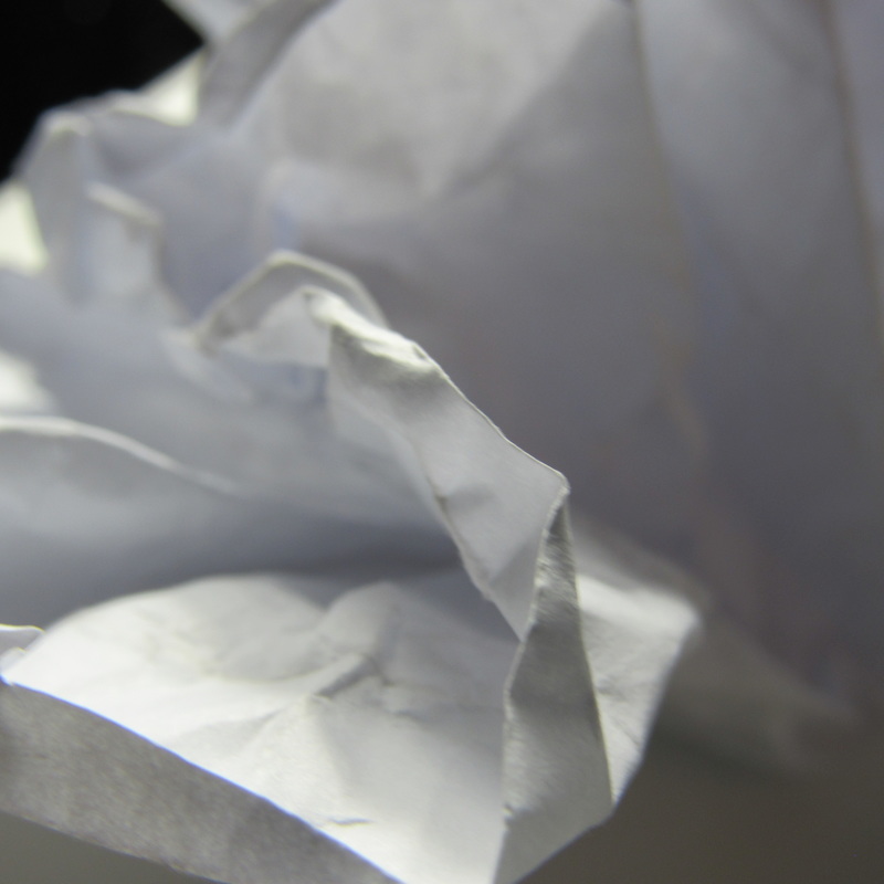
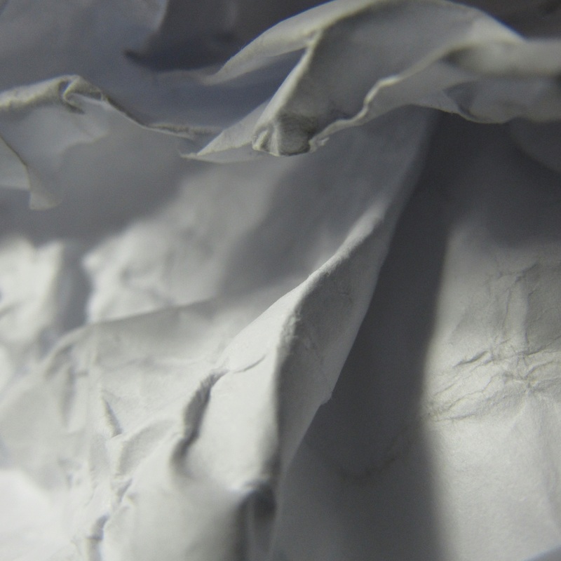
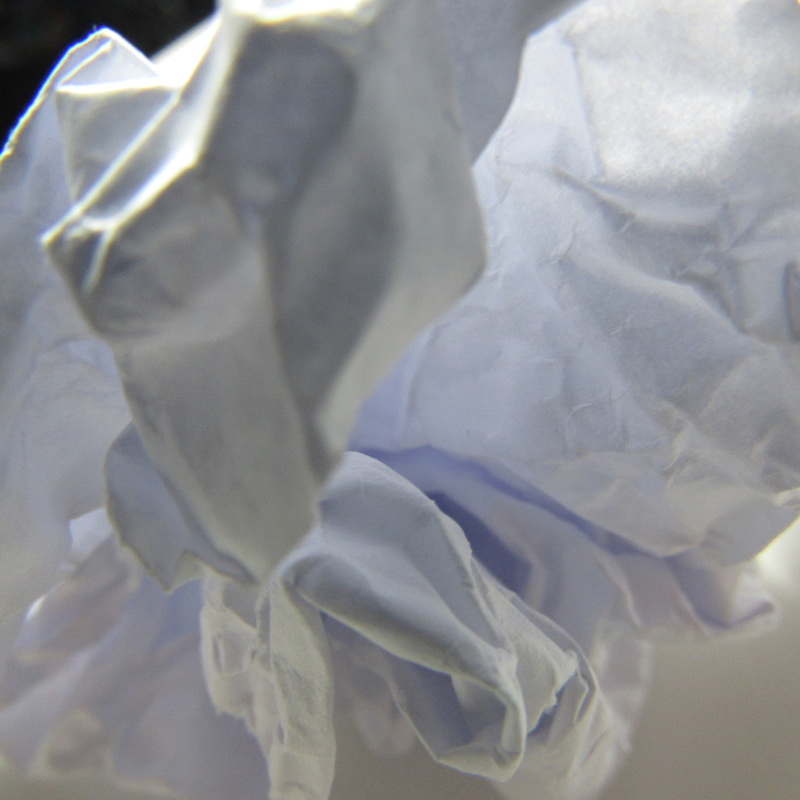
EVALUATION
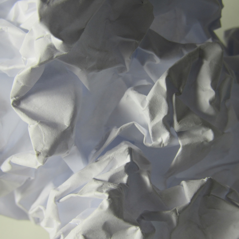
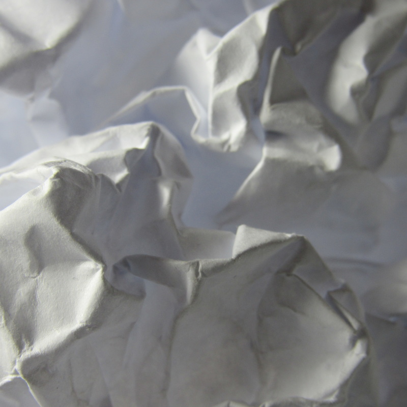
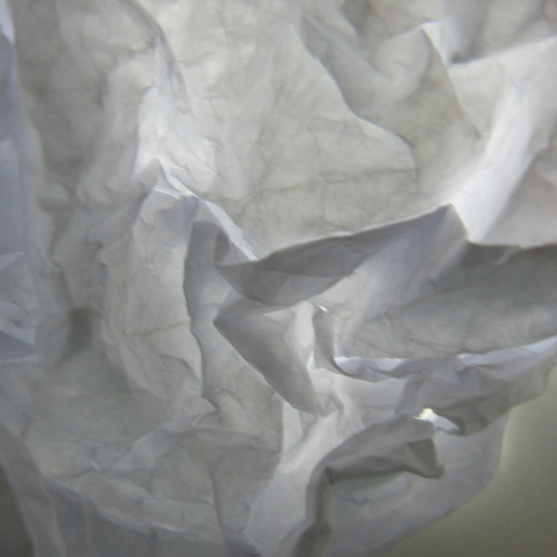
taking pictures of a scrunched up piece of paper did not seem that complicated at first and neither fascinating as it is plain, however having to show no table and no background made you have to only show clear detail of the of the lines, creases, curves, folds and got us to explore in how how much texture you can notice in a photograph and how effective it is. I ended up finding this task difficult because it was having to take 12 photographs of the same thing making the, look completely different so that was meaning I had to fold and screw up the paper multiple times to see how many would come out different. I also could of focused on taking the photographs at different angles and also some out of focus.
Most of these photographs are really dark and there is not much lighting apart from a dull & natural lightings, however it seems to set a scene, it was fun taking theses pictures as it was exploring a different genre of photography which was unusual but effective it was difficult getting to sides of the picture to look effective and most of the time pictures would go out of focus. my favourite photograph is the third one the abstract sculpture is clear but so is the background the dark lighting also gives the photograph more depth. These photographs include all the shapes and is the main focus of the photograph. However the sucessful side of these photos are because of its lines and shapes, there are many obscene lines and shapes which forms a different view.
Saul Leiter
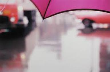
I chose this image because i enjoy the out of focus element, he uses and bold colours
the umbrella is focused at the top, but the background is out of focus. This picture is cropped the background is quite dull however, the umbrella is bright purple at the top.
his use of texture of things like raindrops and show are very effective the best element he uses are out of focus and cropping, in cropping he manages to be able to crop out every thing apart from something interesting a.k.a people and colours and objects. it gives the photograph depth, because if theres no colour, at all it would be boring nothing much to it all.his photographs are abstract because he chooses to take pointless, weird angels and strange. colours in his photos he includes all elements like out of focus, texture thats all included in the abstract theme.
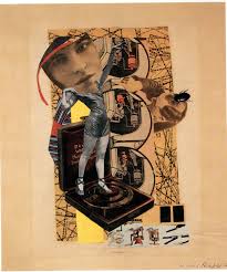
HANNAH HOCH
Evaluation
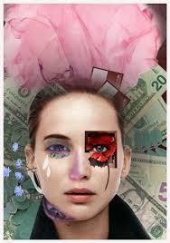
Hannah hoch's work is unusual, it often has old fashion cut out images with a little bit of new bright colours. I find her work funny and different it also takes alot of time to create an image that you like using collages which is what she is well known for. After a period of time she was a great but forgotten artist, she promoted the idea of women working creatively generally in the world of society . She used different elements of time and art to create her collages and was a popular Female artist, she was also a german bada artist. her work was best known in the Weimar period when she was one of the originators of photomontage. every single one of her work peice are completely different. I do like her work however I find it unusual to look at since it dosent look appealing to me because there are no interesting colours. Hanna hoch was inspired by picaso. dada is when the first modern art abract pohotgraph began, in europe in the 20th century
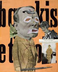
John baldessari
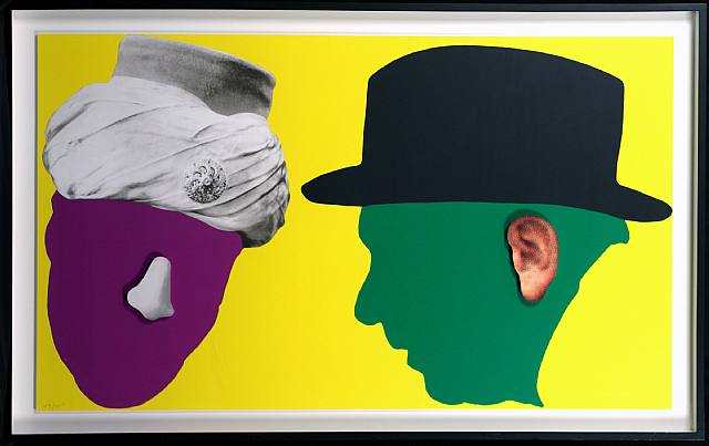
Evaluation
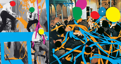
John Anthony Baldessari is an American conceptual artist known for his abstract work. I really enjoy the bright colours that he uses, the unusual way in which he covers the most normal features and creates a completely new image/collage like Hannah Hoch, his photos are all completely different to each other but all link together in the same way, and are noticable to recognise as his work. I see a lot of people and most of their faces are anonymous. He uses found images to create a collage with. Baldesarri is best known for works that blend photographic materials. He is currently 85 years old, there is a lot of space in his photographs such as top middle there is bright bold colours but there is a bolder darker black background used to fill in the spaces. He is known for painting, conceptual art. He is an overall unusual person who also burnt all his work and turned towards photography. John baldessari was influenced by artist and people such as Sol LeWitt, Marcel Duchamp,Lynda Benglis and Giotto. He is known for painting and conceptual art.
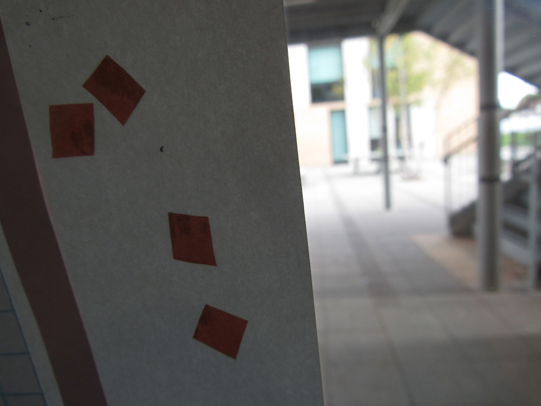
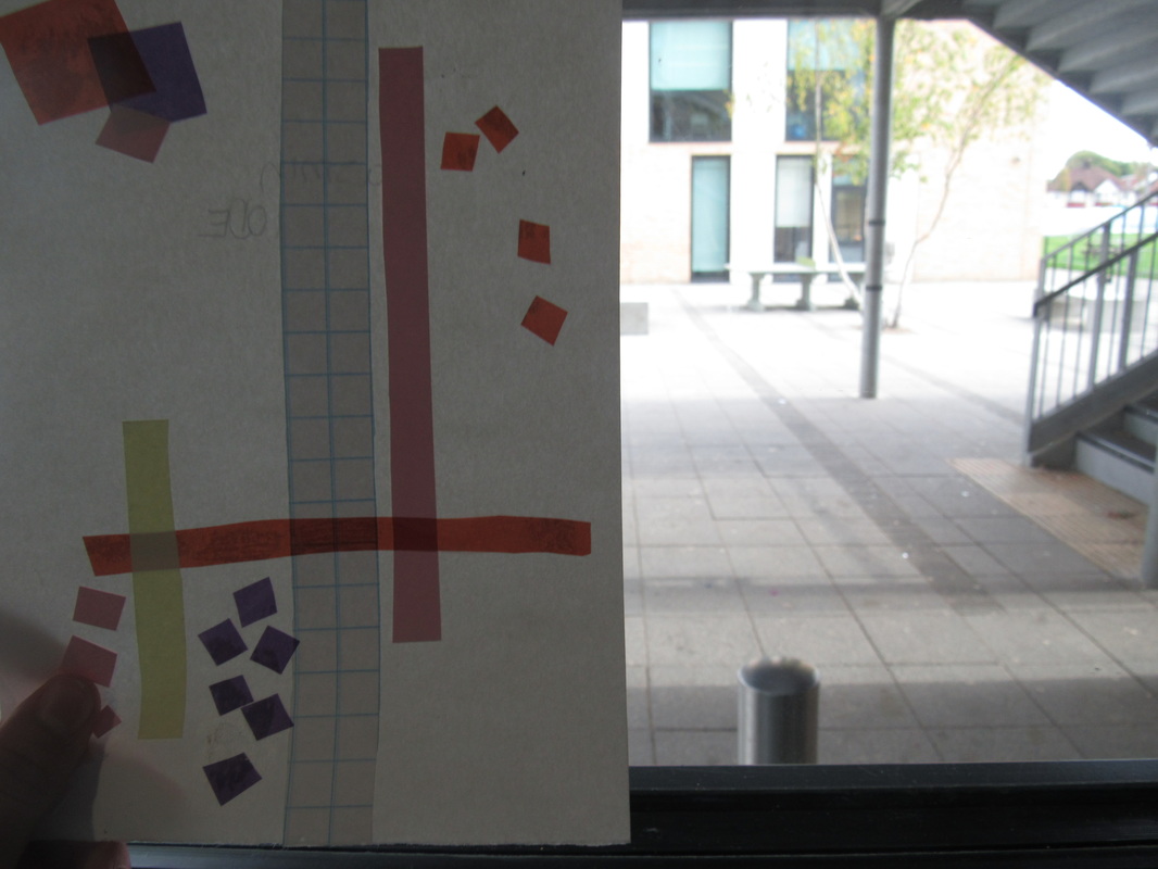
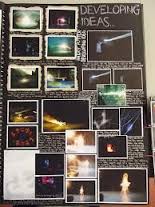
How i did it?
|
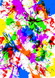
For my final piece i have/will be creating photograms, and also using a collage by making some photograms in a different colour and also cutting up it in to tiny pieces and sorting it out so it abstract. it will be displayed on a A3 black card and will have thin white writing for the rest of the clear space. The photograms will have a faint layer of colour across it, and there will also be a splatter of paint over the writing. The images will be unusual but clear as an objects, there will also be cut ups from magazines such as eyes, lips, letters and nose. at the moment i have only completed my photograms in the darkroom the fixer, developer. I now need to sort out my photograms out on the photoshop and then cut them out.
|
|
My final piece:
For my final piece i decided to paint the board black with white borders and white writing. I chose to do this because i believe it gives the entire design a darker scene and overall i prefer it. Photograms are abstract because it is real life but with a different look and colour. if i left it white i would feel like its incomplete and boring. To me this is more elegant and less dull. I believe this is better because it makes the photograms stand out. However it didn't come out how i thought it was going too however i still like it.
