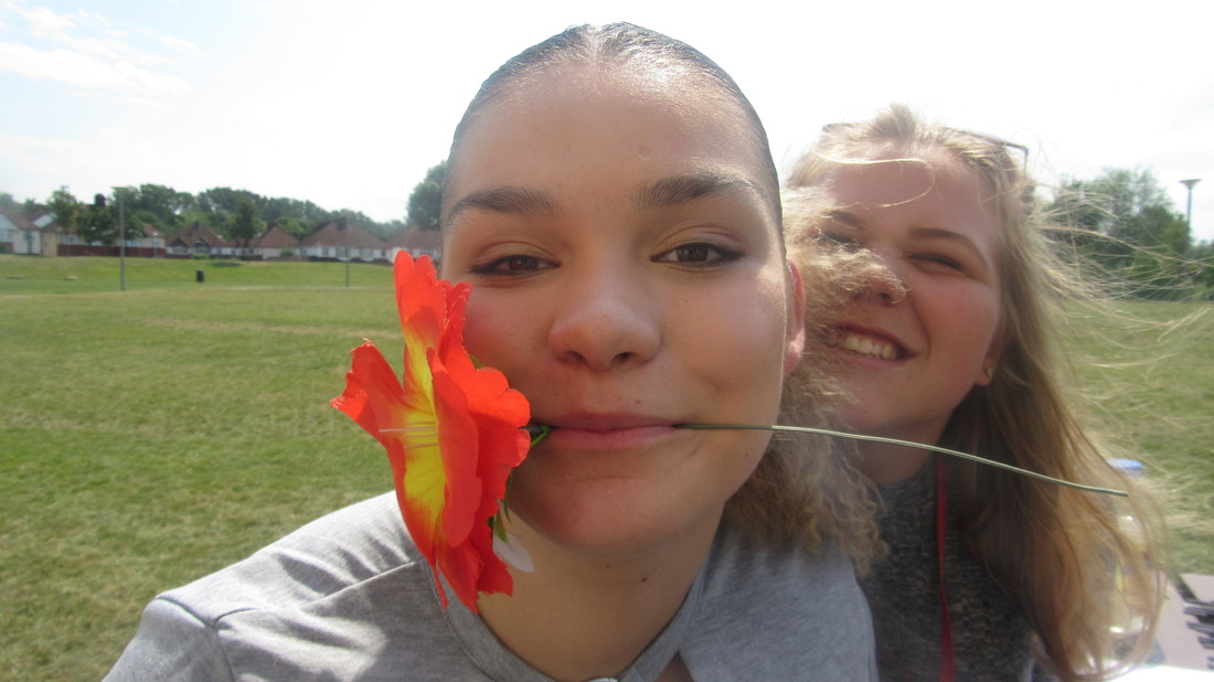
Introduction
This new season of work is based on our own ideas again, were in control, we need to be able to gather thoughts and multiple ideas from one word and remake it. I chose fragments out of the three because I prefer the idea of abstraction and the arty view of photography. This way the images can be looked at in many different ways. Down there is an little summary of each topic and an example to go with it. We had to choose from natural world, fragments and openings and base a whole page around it.
I choose fragments because I enjoy the fact the final piece is more than a photograph I have taken, you explore more with the photograph and be able to look at it in many ways and see what else it can become which there is many different options i could go with. Fragments is another way of saying broken or shattered once something is broken like glass there is multiple pieces of it.
Fragments
|
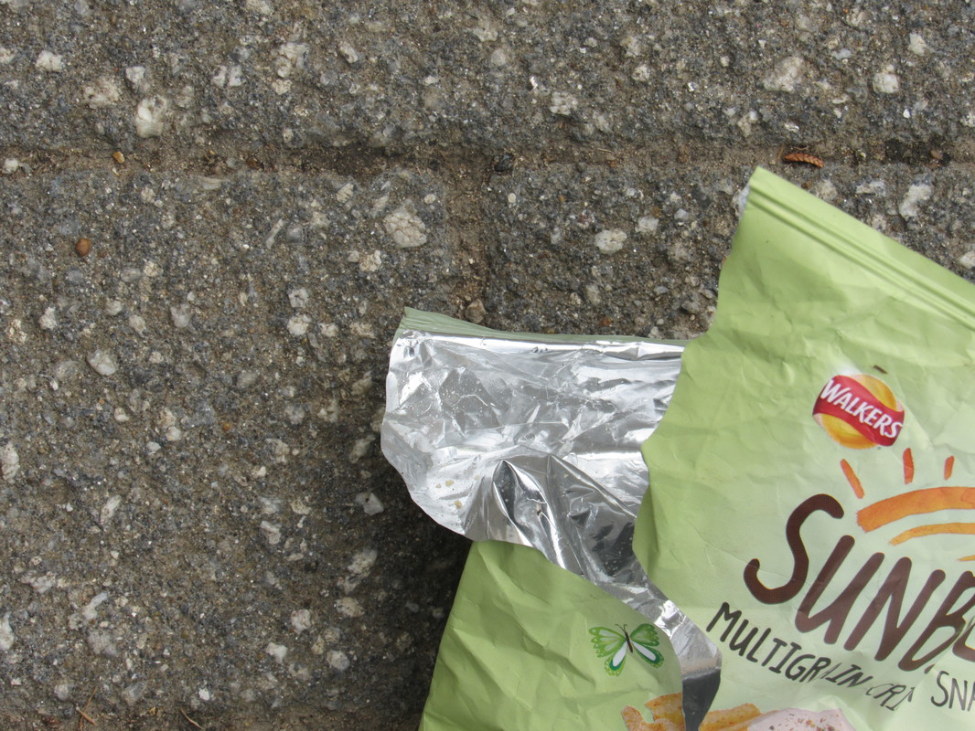
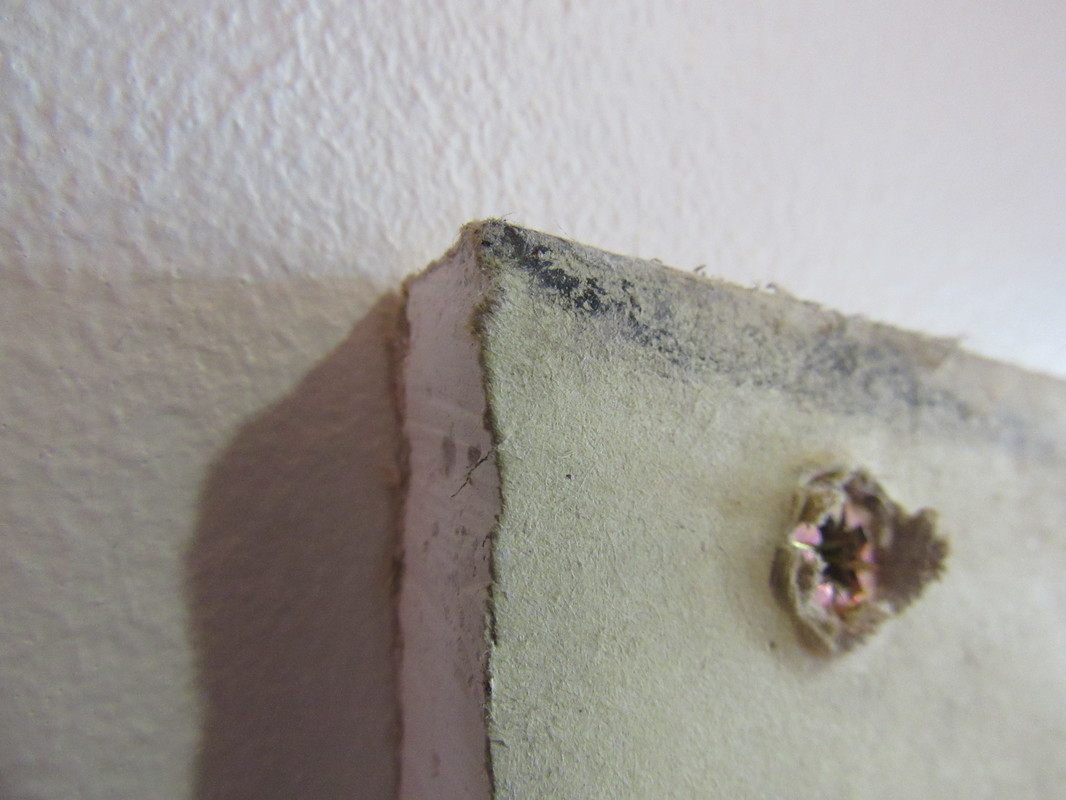
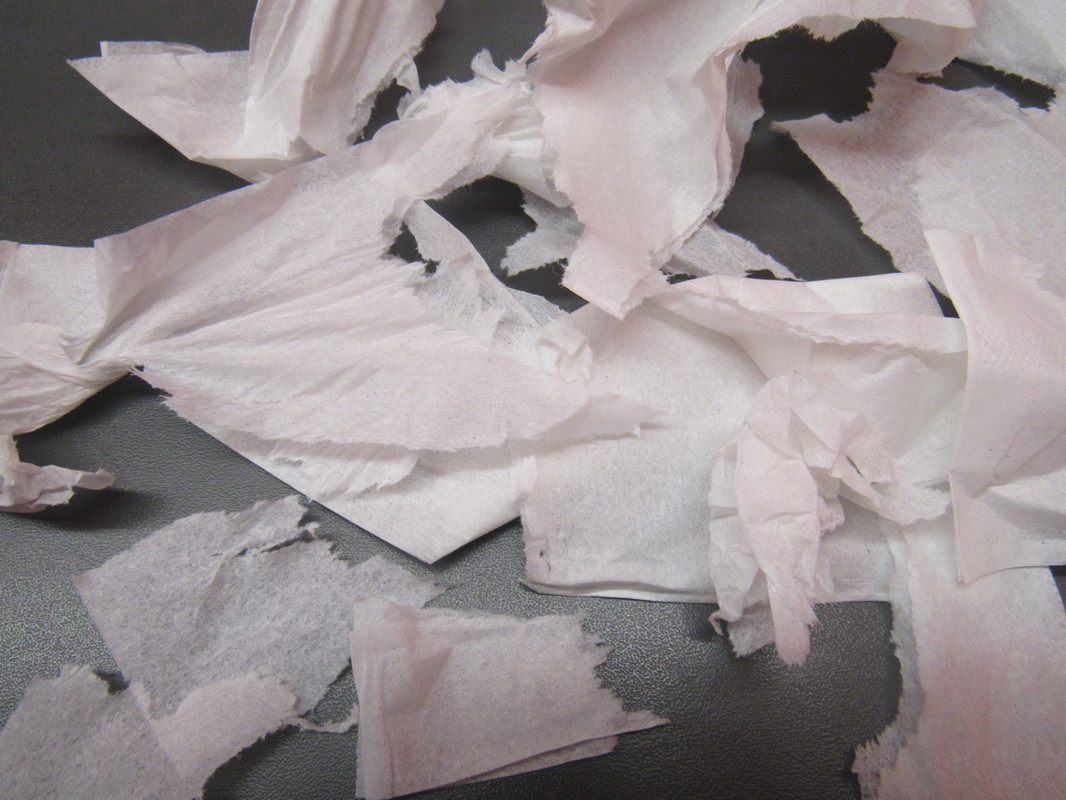
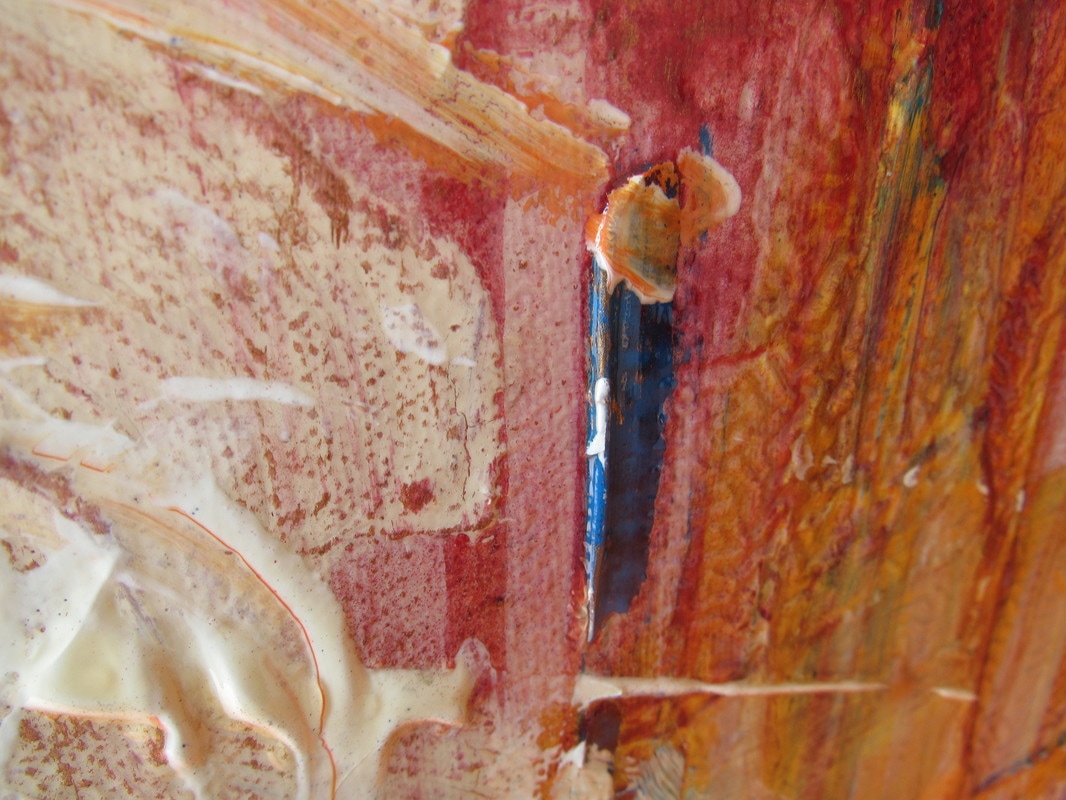
Fragments are a collection of things broken, scars broken glass, a collection of objects, wrappers, blurred and abstract. they are all man-made and unnatural. they are unusual and creative. cuts and bruises. layers on layers. Fragments could also be an incomplete piece of art. an unnatural piece of work on top of a natural piece of work. distorted picture and faces, limbs, mould, decay. beat up old cars. abandoned houses.
|
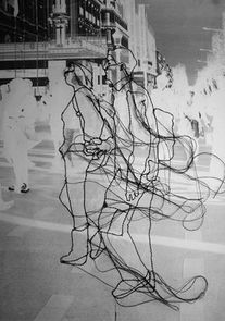
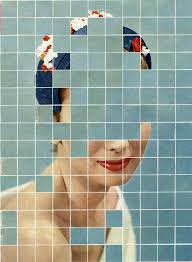
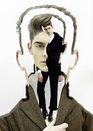
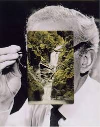
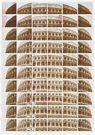
Lucas Simoes
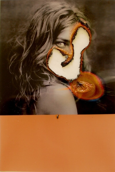
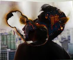
This artist Lucas simoes has represented fragments very clearly, we know there is a person or object or surroundings underneath which has been shaped and cut into fragments of the same piece of work. he has made multiple layers of the same photograph but with affects, shapes and colours. He has azmultiple set of images with two designs. one where the is multiple layers of different parts and lines. And the other one has a photograph of e.g a person with a burned mark in a certain area for example the eyes with an illuminous orange surround the burn marks. I Chose this photographer because his work looks very difficult but is very creative and unusual. you have to look over and over again to experience and view the detail. Parts in the collection of images has parts that are very clear and parts that are not clear at all.
|
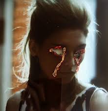
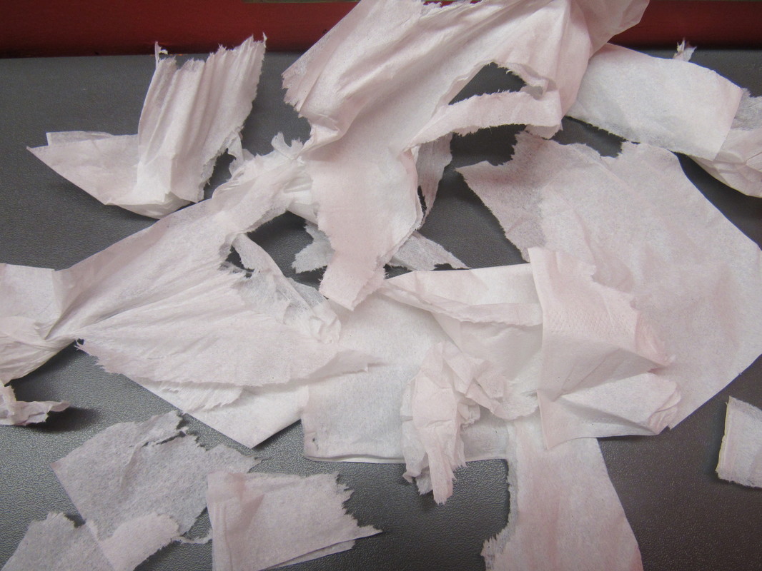
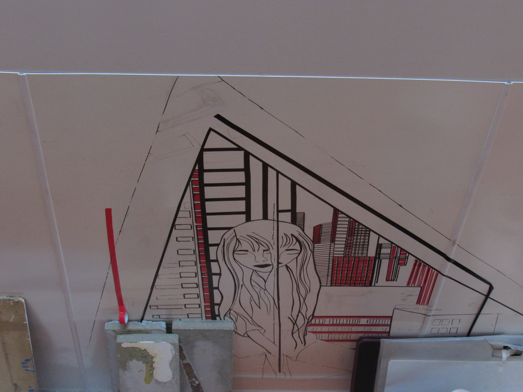
I planned on making a final piece from a photograph of my own and burning the inside of it. but the burning was not successful as it was too windy. however for my final, final piece I might come back to this however do it in my spare time burning the middle and even taking a photo of the photo mid-burning with the flame.
|
|
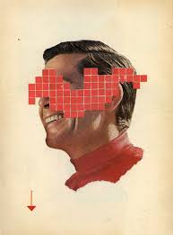
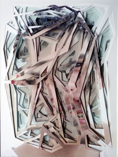
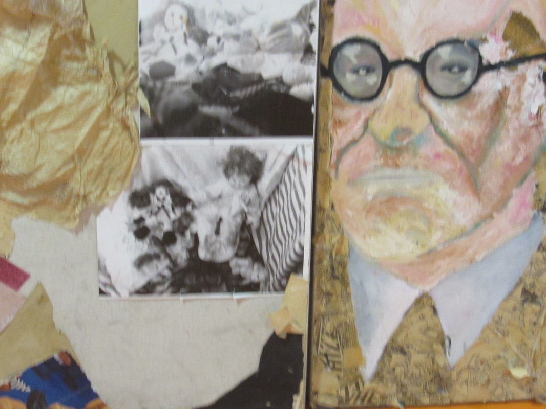
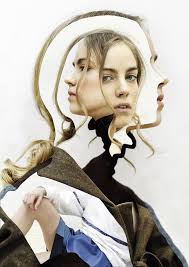
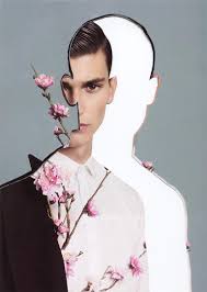
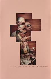
Anthony Gerace
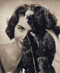
I really enjoy this piece of work as the idea of fragments has really been gathered, the idea of a normal image being transformed into an unfinished piece of work that still really looks affective. It leaves us wanting to complete the image but also we enjoy looking at it. His works remind us of things that are ripped out of a magazine and collage. his work also is abstract and looks old fashioned. majority of his images give of a happy and colourful vibe whereas Lucas Simoe's work off a dark and negative vibe. The image is not neat and is boxed
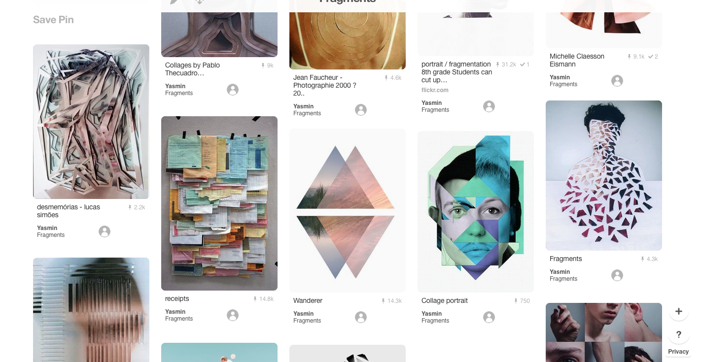
My Pinterest board about fragments, These are just a varies of peoples fragments work that I really enjoyed and added to my fragments board to give me more inspiration. I really enjoy the idea of shapes in there inverted colours. They also use the idea of colour balance and unnatural objects and multiple images. These boards help me look at different artists work all at once, to be able to analyse the lights, shape, design, space, line and focus
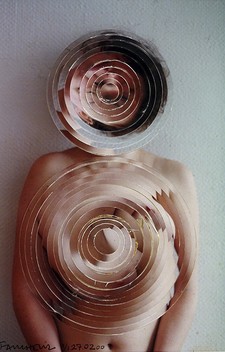
Jean Faucheur
|
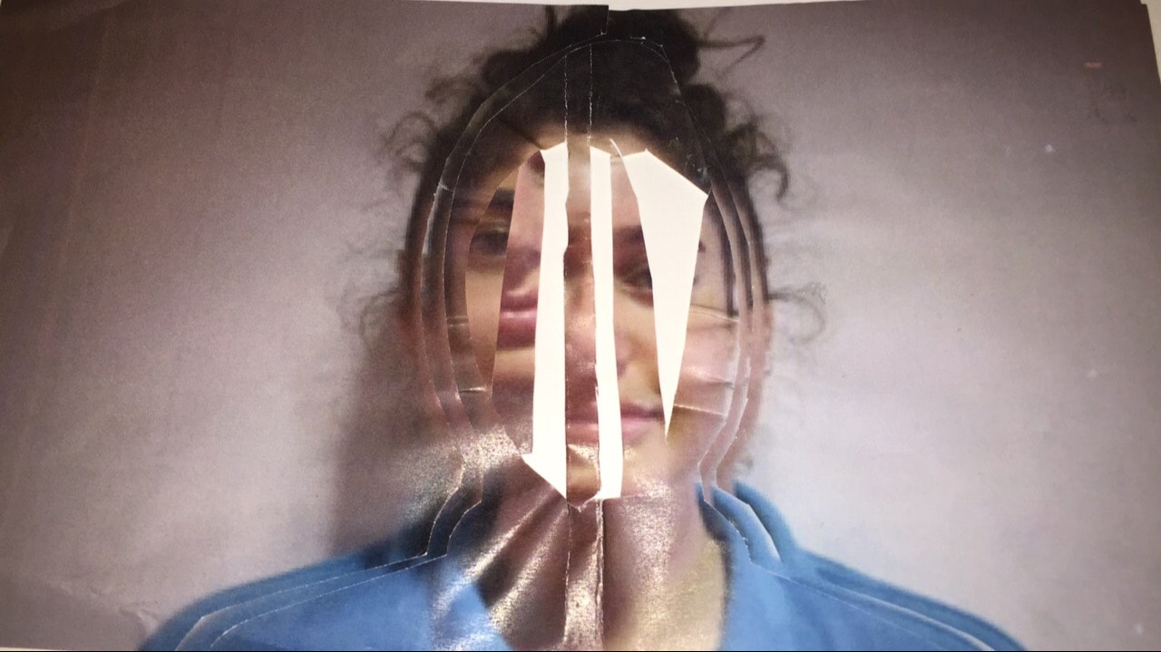
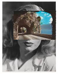
Jean Faucheurs work is fragments, we know this because the background is clear that it is of a naked women standing by a wall however the foreground is of the same images but cut into separate rims and circles and placed to cover the face and chest. the image is affective as the is light coming from the right side and leaving from the left. the circles still leave bits of the hair, eyes, mouth and skins. The lines used are all curved, but her body lines are straight and geometric. the equipment used are cameras and photoshop or cameras and layers of the same photo just changed to spirals. I am inspired by this piece of work because it looks still so natural however fragments has been added into it and to me it has improved the photograph and made it unseen.
|
My own interpretation
|
This is my own interpretation of jean Faucheurs work, however you can see theres a difference to her version towards mine. Jean Faucheur's work is that his circles are neat and close together and tight. However my photo is the same sized circles in a distorted and random order. I believe this is affective as it brings out fragments in its untidiness and confusion. I believe it can be neater and more clear and that I could also go further with this work with improving and create something new, however I would prefer moving on and trying something new.
|
|
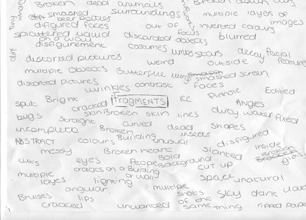
My Fragments Spider Diagram
|
This is a collection of words based around the word fragments, the words that could be brought to life in a photo for example shattered this could be involved with pictures like broken windows. smashed beer bottle. glass put in water and frozen in the freezer. However there are also words like abstraction and layers which means you could use collages, shapes, pieces ripped out of magazines and newspaper. Another example is of skin and wrinkles the idea that broken skin, stitches , cuts, scratches and bruises also come with the idea of fragments. I chose fragments because your work could look incomplete but would still fall under the work of fragments as there is a piece of work missing e.g like a missing puzzle piece the puzzle is not complete but you can still get the idea of the final piece .
|
|
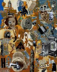
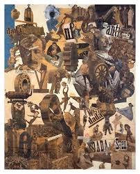
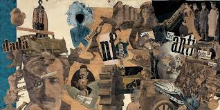
Dadaism
|
Dadaism is an old-fashioned Artistic version of fragments, this way of old magazines. this piece of work is pulled from magazines and very old cut up photographs of men and women in black and white affects. it began roughly in 1916, so the duller colours, the idea of this work was to represent war and the society that was going on around it, the buildings, the activities and the people, titles ripped out of newspaper articles and so on. the pictures are of bodies and machines re-arranged. This work also relates to the world of realism and of old news and peoples from the past but also is real life photographs from the past.
|
|
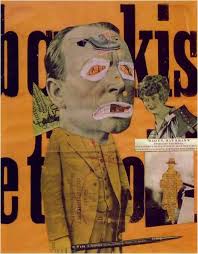
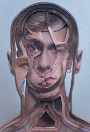
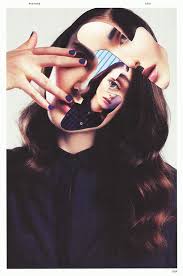
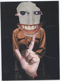
Ernesto Artillo
|
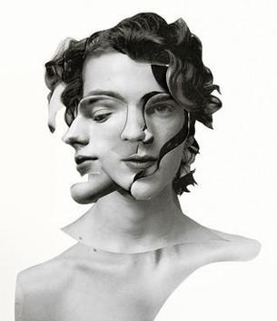
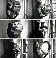
Ernesto Artillo's work is another inspiration of mine, the way he has presented a humans face and neck and made it look like a broken doll. The majority of his work is of people, however he takes things from magazines and makes his own images turn into images of models. his work looks like he takes images of fashion work. however this work is one of his only images that are only in black and white and thats why I choose it as it is only one of his non bright coloured images so he went for something different. Also this is the only image where he has thought to do something different. most of the lines are curved and geometric, there is also many shapes made with the lines, such as circles and triangles. The words I would use to describe this image are; emotional, deep, dark, two-faced, broken, plastic and fake. the image is of the same person but facing two different directions in the same spot which is abstract.
|
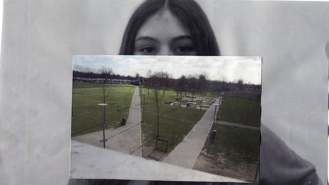
My Own Fragments photographs
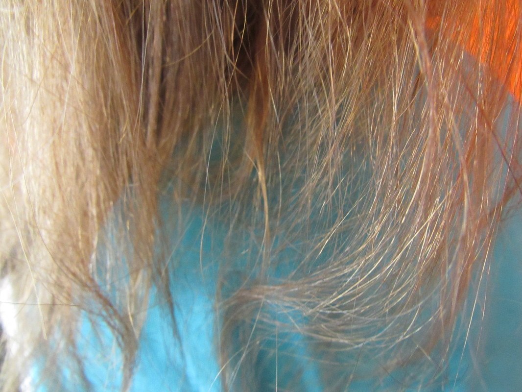
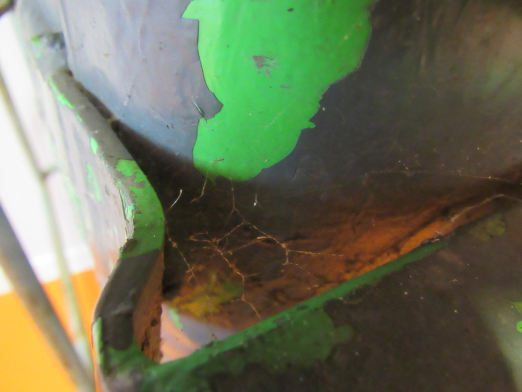
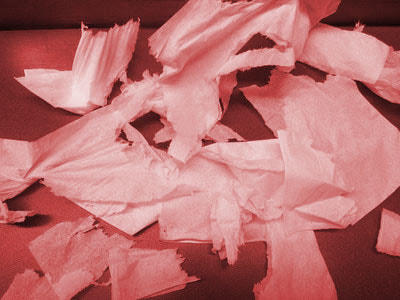
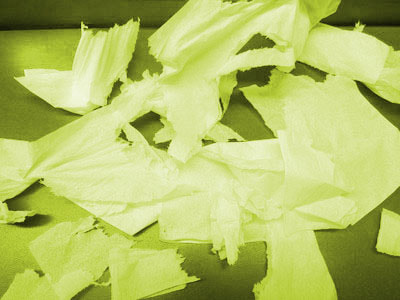
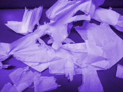
My Fragments photographs; my collection of photographs are very good, I tried capturing photographs of things that are incomplete, chipped, cracked, splattered and multiple layers. I was not able to find anything that looked like fragments to me. These are affective because they involve things that are broken and cracked, however it is not affective because the quality of the focus and angle could be far more improved. The images are affective because they are incomplete and are not "normal" so this all reminds me of fragments, the worst photograph is of my someones hair I took it because the split lines of hair seem to be broken up.
My Final piece: step by step
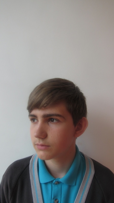
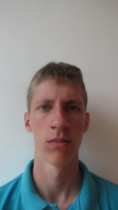
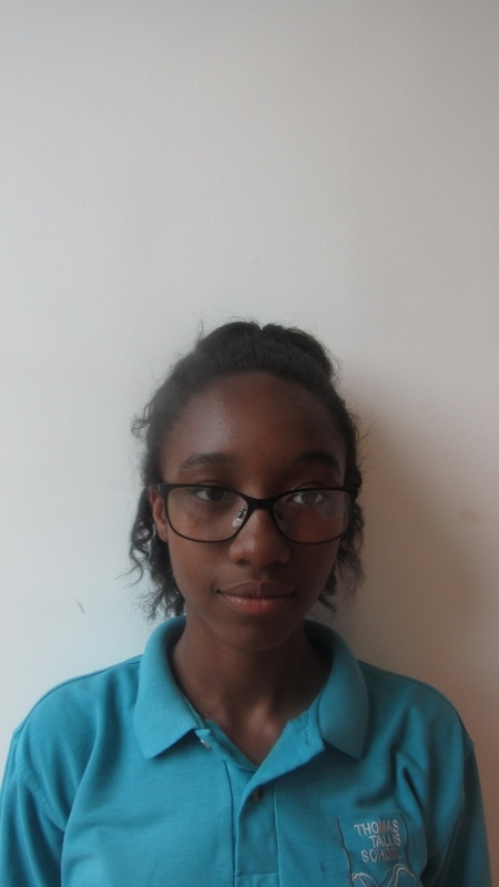
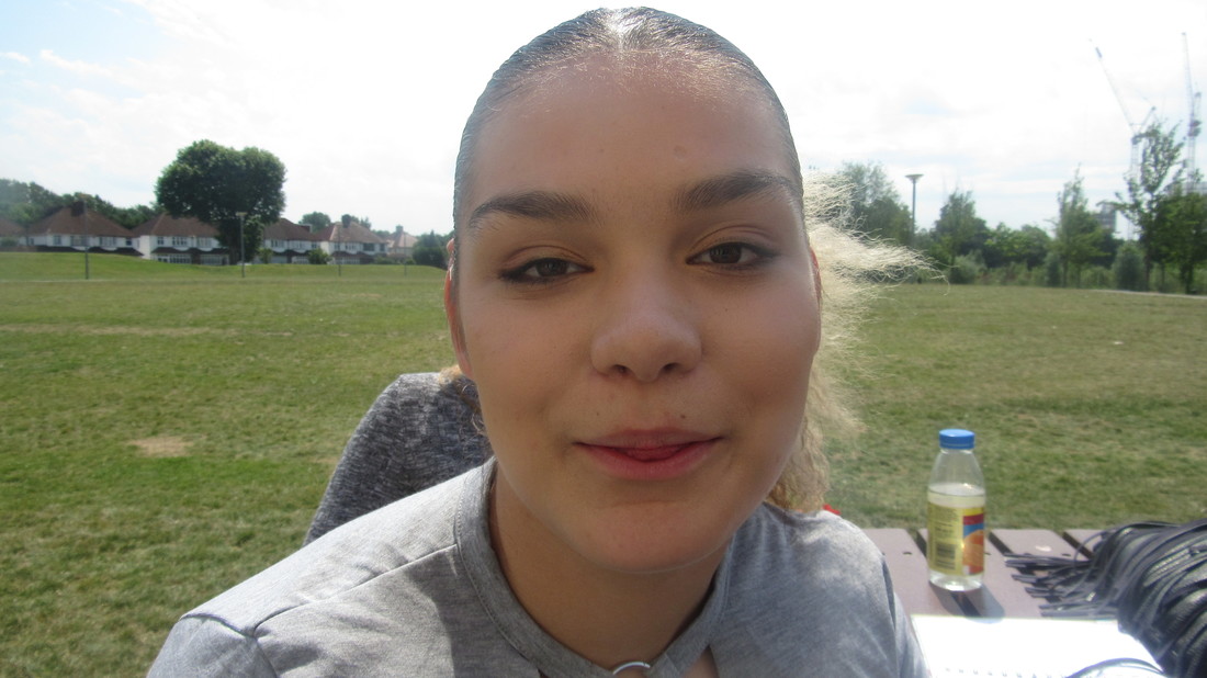
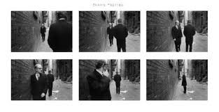
These are the photographs taken for my first attempt at the artist Pablo's work, I took photos of peoples faces up close as that is what the artists style is based around however I am interested in taking pictures of building, bugs etc because I believe layers of nature and wildlife would be as effective as his original style.
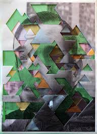
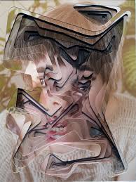
Pablo Thecuadro
I chose this photographers work because of his creativity, the idea that faces are moved around and disfigured on top of each other, I like the creativity of a mixture of human faces and the natural world this gives us a new view of something bright and beautiful. His work is very distorted and the lining is always neat and straight and curved.
Experimenting
These images are my buildings and non-living creatures pictures which I will use to create multiple layers from. Pablo's work also varies from images taken at different angles however they could be high or they could be low angles as the will vary on where you are. As I was in school the height differences weren't limitless.
Lucas simoes interpretation
|
there are two different styles I can recreate with his work for example layers can be apart of two things as there can literally be 2-3 layers cut up on top of each other. Or they can be printed of together however the opacity is very low in each picture.and I did not complete it as I was unhappy with how it turned out. It is messy, scrunched up and unorganised.
|
|
Another interpretation
|
|
|
|
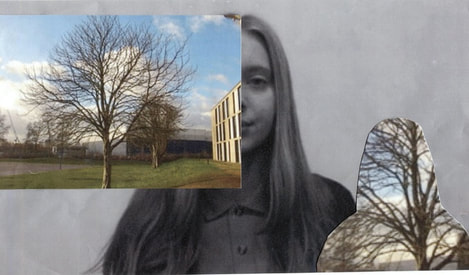
one of my experimentations involves a range of human faces ad natural world, it involves layers, it creates disfigurement and unnatural final images, this is only one experimentation as it is not that great and I do not want this to be my final piece. I want my images to absorb the idea of fragments and this way I will need to think clearly of the new images I will take and absorb abstraction and cut up work or fixed images of a corner of a wall . The photos are effective as they are in black and white and are also layered with coloured photos. I will refine these images by making them neater and spaced out evenly, they will be more thought out and next time I will use photoshop to change the colouring so colours like red, yellow and green can be shown throughout the images.
|
This is the base of where the experiment came from, the first layer that is of a persons face, the second layer is of nature and scenery cut into the image of a person or smaller sized photograph. This is intriguing as there work covers key features of the persons features.
|
|
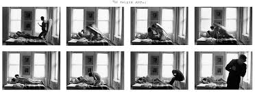
Duane Michals
|
Duane Michals work has a way of showing emotions, his dark black and white theme shows dark emotions and even makes us asks questions as its also quite mysterious. His collection of dark tones and mixed with the same but not same photographs creates a quite deep and in depth feeling.
|
|

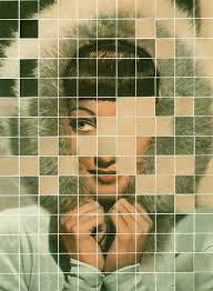
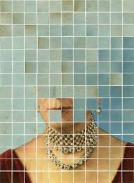
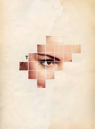
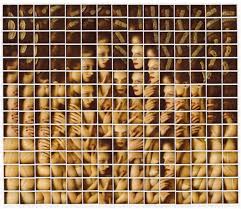
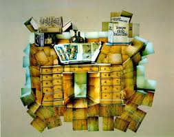
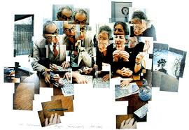
Maurizio Galimberti
|
|
The work consists of smaller sized objects which are tiny squares that are placed in to collage and are repeated or are made up of little squares the creates an entire image. For example the image on the top right is a group of people which Is disfigured by how many squares there are.
|
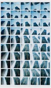
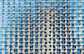
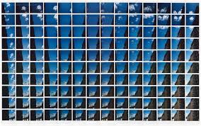
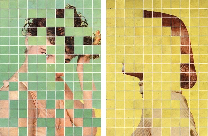
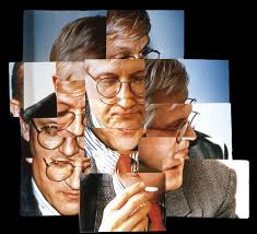
David Hockney
|
David Hockney work is good as it also includes layers, however the scattered layout his creation makes an effect like there is a multiples blur of images. The images are also squared and repetitive. His designs never usually stay the same, he includes people,outdoor scenery 's, buildings and fruit. He has experimented with new things so every piece is unique. It looks as if it has two layers one bigger than the other.
|
|
Hannah Hoch
|
Hannah hoch uses collages in her work, usually images from magazines and unusual imagery. They are disfigured and kind of creepy , stuck on images from magazines and newspapers. The artists uses images of peoples facial features, body parts and other things that end up being made to look like a human figure. I like this work because I enjoy ho random pieces of work can look original and brand new. Her work looks like an original image which has been disfigured.
|
|
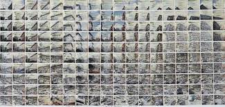
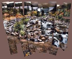
Sohei Nishino
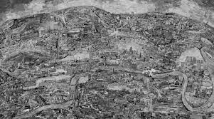
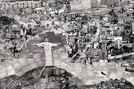
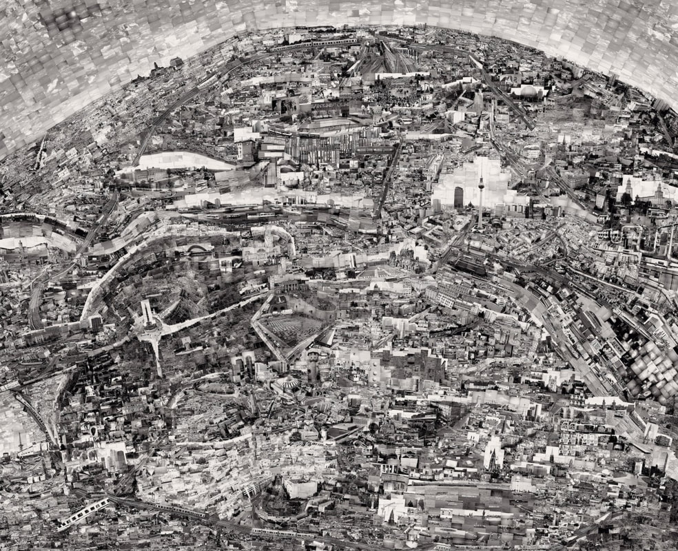
the photographs are dark coloured and consist of different ranges of grey, it has a lot of cities and towns from a hightop view, there are a few dark spots and patches where there is a different bit of scenery, the photographer uses high views to represent the unknown not being able to physically see whats below but seeing the object and shapes surrounding it.
My plan:
My plan for my fragments final piece is that I use these images above of people as a collection of images, I'm going to get different bits of different coloured glass and layer it on top of the images of people leaving bits of cracks in-between to make it clear its broken showing the entire 'fragment idea'. It could be any colour of glass from green to clear to brown. or with these images I might use photoshop to erase some of the photo so that it is white and then draw the lines that match up with the photograph.
|
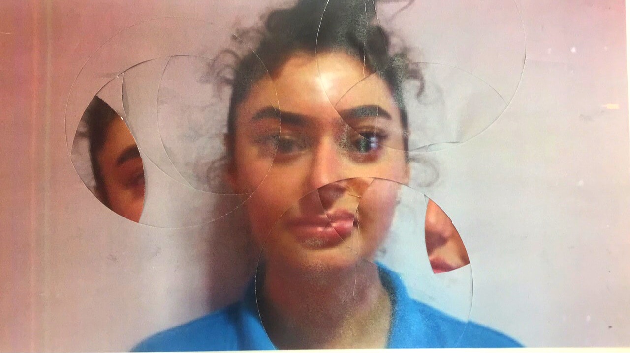
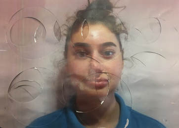
This is an attempt at a final piece, trying out overlaying the same photograph over and over whilst cut out circles are removed and then the original photo layered on top. This image did not come out good, however the idea is that the person looks disfigured and unrecognisable but still able to identify what it is. This can come under fragments as the original image has been distorted & recreated. There are 8 photographs all stuck together in to one image. The paper looks rough and untidy and is not pleasant to look at. This is something I will not be continuing for a final outcome because its not different and does not stand out.
|
|
|
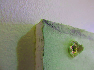
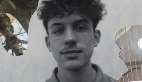
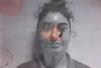
burning effect, inspiration from Lucas Simoes burning the paper
My plan
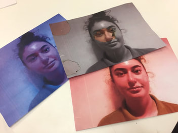
My plan is to have a collection of images, portraits of peoples faces burnt and disfigured. The front paper will be black&white with the normal colour placed underneath where the burning has left a whole. Then I will also add another two layers underneath the colours I will use will be blue, red, purple, pink, green and yellow as these will all come together on a bigger board and hopefully the colours will not clash. Im choosing this idea as it is simple but looks effective and definitely come under fragments. However if its done rough and untidy then it will look unsatisfying and dull. The picture I will use will be this one above as it is based in the centre and is faced forward. However also for my final piece I will have images that are cut up and abstract, and I will also use the circular cutters which will form another multiple layer piece and the idea is also from Lucas Simoes work. There will be a variety of different designs in my final piece.
